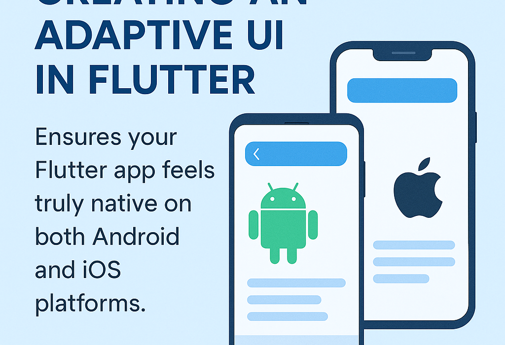
Adaptive UI in Flutter for Android and iOS
Creating an adaptive UI ensures your Flutter app feels truly native on both Android and iOS platforms. This involves more than just visual consistency — it means aligning your app’s design and interaction patterns with the unique conventions of each platform. For example, iOS users expect a navigation bar with Cupertino styling, smooth transitions, and edge-swipe gestures to go back. Meanwhile, Android users are accustomed to a Material Design layout with a bottom navigation bar and a back button in the system navigation.
Flutter simplifies this adaptation by offering platform-aware widgets like CupertinoPageScaffold and MaterialApp, allowing you to target both platforms efficiently without duplicating code. You can also use the Platform.isIOS and Platform.isAndroid checks to render platform-specific UI components when needed. For responsive typography, Flutter’s MediaQuery and TextScaleFactor can ensure text scales appropriately based on device settings.
By carefully crafting adaptive layouts and platform-sensitive interactions, you improve the user experience and retention. Most importantly, doing so with a shared codebase maintains development efficiency and consistency across devices. Whether you’re launching a personal app or a commercial product, adaptive UI is key to winning user trust and making your Flutter app feel right at home — no matter the platform.
Why Adaptive UI?
Even though Flutter allows for code-sharing across platforms, user expectations differ:
iOS users expect Cupertino-style buttons, transitions, and gestures.
Android users expect Material design, drawers, FABs, etc.
Goal: Provide a consistent functionality, but a platform-appropriate experience.
🔧 Key Techniques for Adaptive UI
1. Platform Checks
Use Platform.isIOS and Platform.isAndroid to conditionally render widgets.Lorem ipsum dolor sit amet, consectetur adipiscing elit. Ut elit tellus, luctus nec ullamcorper mattis, pulvinar dapibus leo.
dart
import 'dart:io';
Widget adaptiveButton() {
  return Platform.isIOS
      ? CupertinoButton(
          child: Text('Tap me'),
          onPressed: () {},
        )
      : ElevatedButton(
          child: Text('Tap me'),
          onPressed: () {},
        );
}
2. Cupertino vs Material Widgets
Flutter provides two design libraries:
Cupertino(iOS)Material(Android)
Example: Adaptive Scaffold
dart
import 'dart:io';
import 'package:flutter/cupertino.dart';
import 'package:flutter/material.dart';
class AdaptiveScaffold extends StatelessWidget {
  final Widget body;
  AdaptiveScaffold({required this.body});
  @override
  Widget build(BuildContext context) {
    return Platform.isIOS
        ? CupertinoPageScaffold(
            navigationBar: CupertinoNavigationBar(
              middle: Text("iOS Page"),
            ),
            child: body,
          )
        : Scaffold(
            appBar: AppBar(title: Text("Android Page")),
            body: body,
          );
  }
}
3. Adaptive Widgets Package
Use flutter_platform_widgets to write less conditional code.
dart
import 'package:flutter_platform_widgets/flutter_platform_widgets.dart';
PlatformScaffold(
  appBar: PlatformAppBar(
    title: Text("Adaptive UI"),
  ),
  body: Center(
    child: PlatformButton(
      child: Text("Click Me"),
      onPressed: () {},
    ),
  ),
);
✔️ This package automatically renders the appropriate UI for each platform.
4. Adaptive Layouts (Responsive + Adaptive)
Use LayoutBuilder or MediaQuery to adapt based on screen size, not just platform.
dart
Widget adaptiveLayout(BuildContext context) {
  return LayoutBuilder(
    builder: (context, constraints) {
      if (constraints.maxWidth < 600) {
        return MobileLayout();
      } else {
        return TabletLayout();
      }
    },
  );
}
✅ Conclusion
An adaptive UI in Flutter allows you to deliver platform-specific experiences while maintaining a single codebase. Use conditional rendering, platform-specific widgets, and responsive design principles to give your users a familiar and intuitive interface.